Teamwork

Clayton Tom and Walter Moving The 10 ft Kick
Clayton,Tom and Walter Moving The 10 ft Kick

Loading the bottom 2/3 of the 10 foot Kick for its trip to the mold maker required teamwork. Tom and Walter already proved their teamwork skills this fall, when they helped rescue flood victims trapped outside their car, just before it was swept away.  Here they are at work again, showing that their teamwork has other uses. Thank you, Walter and Tom!

The Kick at Ten Feet

The Kick almost finished

Nearing the end of my summer’s project, The Kick is now 10 feet tall.  I disassembled the clay sculpture to allow for easier finishing before I trucked it to the mold maker. 

The KIck disassembled
The Kick disassembled

Finding the Unexpected

two striped grasshopper on Queen Annes Lace
Two striped grasshopper on Queen Anne’s Lace

I had a new, for me, sighting of striking beauty last week. A male Thomas’s two striped grasshopper (Melanoplus thomasi). We like to leave our road vergers un-mowed until all the wildflowers have had their say for the year. To some it looks a little rough and neglected but there is beauty there for those who look. I was collecting ripe seed heads of Queen Anne’s Lace (Daucus carota) for use in pepping up an area where it had a weak showing. There on a seed head was the grasshopper. His neon colors a striking contrast to the dull tans and browns of the seed heads I was clipping. It’s turquoise blue topside, with coral red legs and a lime green undercarriage, made it looked more like a gaudy item from a souvenir shop, than a bug in a field.

Goldenrod

goldenrod 2020
Goldenrod

In a moist, lower meadow where I often, walk the blooming of the Goldenrod (I am pretty sure Solidago gigantea in this case) is a harbinger of shorter days and the coming of fall. Its flower is one of the strongest yellows of any flower because it has just a hint of red mixed in. This flashiness trips up Goldenrod’s reputation, for few notice the Ragweed (Ambrosia artemisiifolia) blooming nearby. Ragweed puts all its energy into creating pollen (of hay fever fame), so it has a very inconspicuous flower, leaving poor Goldenrod to take the fall.

The Fox and the Grapes

Fox and grapes

What Aesop did not say – fallen grapes are quite tasty.

The back story:

When Clayton designed our house, he wanted a lot of light, which of course meant a lot of window space.  At the same time, he didn’t want to waste energy cooling a house that was being heated by the summer sun.

Having an engineering type of mind, Clayton measured the angle of the sun in the summer, and decided to plant grapes which could be trained up a pergola which would be constructed on the south and west sides of large plate glass windows.  This way, the fully grown summer grape leaves would provide shade from the top of (and spilling over the edge of) the pergola.  In winter, the grapes leaves have died back and the sun pleasantly warms the room.

What Clayton didn’t anticipate was all the animals which would appreciate the sweet grapes: birds, especially catbirds, raccoons and possums (which have climbed up the grapevines, sometimes with their babies in tow) and now, apparently, teenage foxes.

Why is creating a painting like going to the grocery store?

There are options on how to shop for food, just as there are on how to create a painting. When shopping   A) One can just go grocery shopping and buy what strikes one’s interest once there. B) One can write a shopping list before going shopping, and then zoom all over the store looking for those items. C) One can write the list according to the layout of the store and pick up the listed items in an orderly fashion. D) One can make the list knowing the store layout, and still deviate from the list as inspiration strikes.

In painting, as in grocery shopping, planning and inspiration combined can produce the most interesting results.

First Poppy of the Year

A solitary bit of red. This reminds me of the rivalry between John Constable and J.M.W. Turner in the early 1800’s.  The rivalry broke into very public view at the Summer Exposition of the Royal Academy in 1832.  Their entries to the show were hung next to each other (in this post, Constable’s Opening of the Waterloo Bridge is above Turner’s Helvoetsluys), setting up a direct comparison in style and technique.  At the last minute (on Varnishing Day, when artists are allowed to make adjustments to their already hung work), Turner took it one step further; he added the red buoy to his seascape, thus overwhelming all the red on Constable’s canvas.

I have always though the single red buoy greatly improved Turner’s painting, even if it was done to needle Constable.

A Camellia in the Artist’s Garden

Camellia japonica

We teeter on the edge of how far north Camellia japonica can be a successful indulgence. The best possible location we have for growing camellias is in the micro-environment of our walled-in Japanese garden.  Nature, however, was not so sure.  For a number of years we battled back, nurturing the camellia along, pruning out the winter kill, hoping for a better result next year. Then this spring – zap! I turned the corner in the garden one day and there it was – in full bloom. The camellia seemed to think it had been sojourning in Georgia or at least North Carolina for all its boastfulness. My thought was, nice try, but I am sure the mild winter deserves the credit. It is similar to the color in a painting trying to claim the glory, whereas tonal value is really doing the heavy lifting.

Turner at the Mystic Seaport Museum

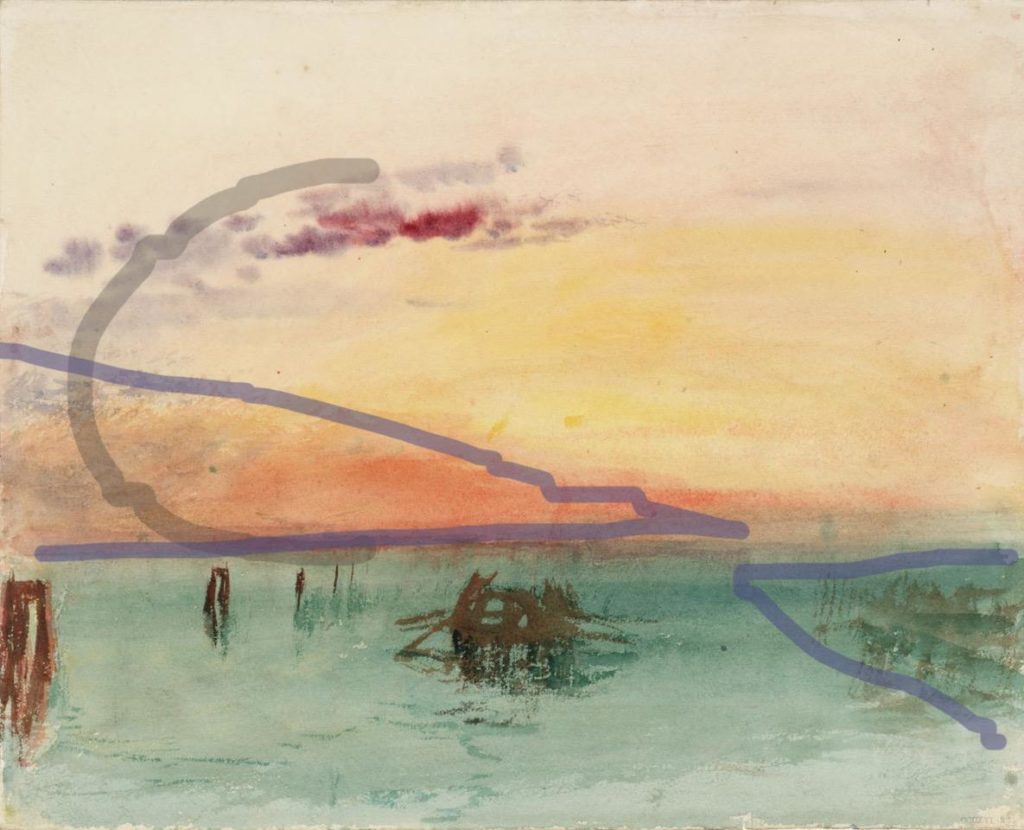
Venice: San Giorgio Maggiore – Early Morning,” 1819

At the Mystic Seaport Museum are some 90 of Turner’s watercolors from the Tate in London. Chronologically, the paintings run from the mid 1790’s to the 1840’s. Given the chronological span of the show, it seemed a great opportunity to see how his style evolved over the years.

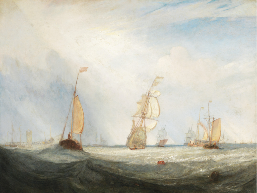
While I didn’t see what I expected, I found this a rare chance to study Turner’s technique. The show starts in the mid 1790’s with very realistic watercolors which would be instantly recognizable as British, from the late 1700’s. Turner soon evolved into a looser style, painting mostly landscapes or seascapes. Once he hit his stride, he really didn’t change very much. In fact there two paintings 30 years apart which are virtually identical, except for their size. Throughout, he used only three colors – blue, red, yellow – and did not mix them, relying on tonality for strength.

Compositionally, he stuck with a limited number of formulas.  Landscapes were mostly composed of tonal wedges used to create a sense of depth. A sprinkling of vertical masses, as in canyons or alleys, appeared occasionally. A sweeping half circle reminiscent of the letter C or its mirror image was used compositionally in both land and seascapes. *(See below.) Seascapes also made use of a horizontal composition. Whatever the composition, tonality was always a touch stone.

I should mention here an under-appreciated aspect of Turner – he derived a steady income as an illustrator. Only a few of his watercolor illustrations made the show. They have a strong connection compositionally and tonally with the larger paintings in the show. The difference in the illustrations is their size (book sized) and having some real, linear detail worked in. I was left wondering whether his work as an illustrator gave him such a commanding sense of tonality. Remember the adage – color gets the credit but tone does that work. Engraved illustrations were printed with the same black ink as the type in the book, so tonality was of the utmost importance.

Although I did not find the stylist progression I had expected, this extensive selection brought home both Turner’s mastery of tone and his limited, but strong use of color. The connection between the watercolors shown and the great canvases that spring to mind when we think of Turner is threefold – tonality, limited, but clear color, and thin washes of those colors.


A Hound’s Feet


A comment on a recent Facebook post reminded Clayton about the sculpture he did of Ben Hardaway. Happy Thought was Ben’s favorite horse at the time, however, Ben thought that he looked a little big for her. Instead, Ben chose to be on Rhythm for the sculpture Clayton did with five of his favorite hounds.

While Clayton was working on the hound part of the sculpture he had a conversation with Ben about hounds’ feet. Clayton commented on my preference for a hound with a foot more like that of a fox or greyhound. He felt their longer foot seemed better suited to loping and running, than the more cat-footed hound preferred by so many huntsmen.  Ben, who must have had north of 60 couples at the time, pulled from the kennel a hound which was very nondescript in every way except its feet. He declared the hound had the best feet in the pack.  A fox or a greyhound would have been proud.


Animals’ Encounters with Sculptures

Clayton installed his bronze sculpture, Great Blue, in October.  Within two weeks the family spotted another heron nearby.  The live heron seems to like its new friend – no threat – just another presence at the pond.

We are intrigued by how live animals of the same species respond to Clayton’s sculptures.  Dogs sniffing the rear ends of  A Couple of Hounds, horses stopping stock still when they realize the Equestrienne is in front of them and not moving, and the list goes on.  Herons aren’t particularly social until mating season, and by now the live heron would have recognized this sculpture wasn’t moving, but seems to be happy to have an inert friend.